 Synergy was critical to use in my music video as it is a key factor of a promotional video and it is also just as critical to the Indie genre itself. We also had to use synergy in order to create a brand identity for Chase so my initial TA can easily recognise him or one of his products. Firstly I used the same outfit for a few shots in the music video, the digipak and the advert so Chase is more recognisable to the TA. I also used the same photograph for the digipak and the advert once again so the TA instantly recognise him, the colour used on the images also links to the colouration of the video, thus creating synergy across the different media platforms by linking the video to the ancilleries.
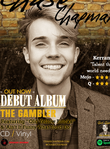

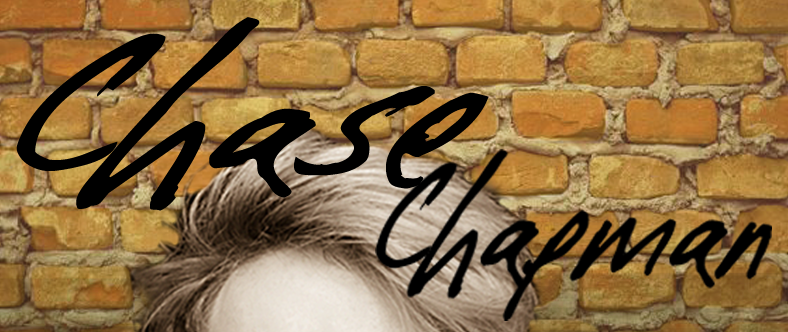
 Another convention I adhered to of music promotional products was to use the same font (Cold Spaghetti BTN), the research I conducted into synergy between other bands all resulted in them having the same font on different products and different albums, I decided to adhere to this as it created a brand identity for Chase and made his products instantly recognisably to the TA. I believe this font also adheres to the Indie genre as it is unique and messy, it gives Chase a distinctive look and due to this reasoning I feel it was successful on the media products.
 I have also used synergy through the clothing of Emily and the fonts on the digipak, I felt red was necessary for Emily as she is a girl that is causing Chase a lot of problems and when referring to semiotics red can link to love and danger, two factors of which Chase is receiving off of Emily.
As well as this linking to the narrative it also shares synergy with the cards that I referenced to Barthes symbolism, this gives our TA more to take in and think about when wondering why red is quite a discrete yet key colour in and on our products.


 In the digipak I also included some of the symbolism from the video, not only does this make discrete links to the narrative through Barthes theory of symbolism, it also makes the audience question why they are an important part of the digipak and how large of a part do these cards play in the narrative in the video. I also have used them as they make large connotations to gambling and due to the album being called "The Gambler" I felt it was necessary to put these symbols linked to gambling on the disc, the cd spine and in the music video.
 I also added the logo of our groups record company "Reckless Records", I feel this not only gives the digipak and the advert a much more professional look but it also is a key convention of a promotional ancillery that I felt I had to adhere to and it also adds to Chase's and the record companies brand identity as it makes both companies more recognisable through this product.
 Cross media convergence was also a key convention of promotional ancilleries I felt I had to adhere to when creating the advert and the digipak. Firstly as we are trying to attract a young audience, including links to social media is a direct way of reaching out to youth culture as technology is a way of life for younger people, therefore a larger audience can be attained by adding these links. They are also a key way for the audience to find out more about the artist if they're interested, e.g. new songs and tickets.
 I also applied synergy by using the same rural location on the digipak, the advert and in the music video itself. This adheres to the conventions of having a low budget set in the Indie genre for music videos and photoshoots. The use of these locations also reaches out to a Northern audience as we used very gritty, down to earth locations in the video and for the digipak and advert.


No comments:
Post a Comment